Plotting and visualization
Topographica includes a general-purpose system for managing and plotting visualizations of Sheets and Projections. New types of plots can be added easily, without any GUI programming, allowing users to visualize any quantities of interest.
Basic plots
The basic plots useful for nearly any model are demonstrated in the LISSOM tutorial:
- Activity
- Plots the activity level of each unit.
- Connection Fields
- Plots the strength of each weight in each ConnectionField of one unit.
- Projection
- Plots an array of ConnectionFields making up a Projection to one Sheet.
- ProjectionActivity
- Plots the contribution from each Projection to the activity of one Sheet.
As an example, the most commonly used plot is Activity:
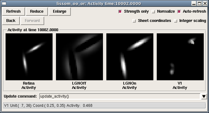
This group of plots (a “PlotGroup”) includes one plot per Sheet, and this particular simulation has four Sheets. Each plot is a bitmap representation of the matrix that makes up that Sheet. Moving the mouse over each image will show the coordinates at that location, as well as the value of the plot at that point. Note that two sets of coordinates are shown: integer matrix coordinates, which show the internal layout of units within the Sheet, starting at the upper left, and floating-point sheet coordinates, which show the Topographica density-independent coordinates used when specifying parameters in scripts and the GUI (with 0.0,0.0 usually at the center). Right clicking at the location shown (usually control-click on a 1-button Mac system) would allow the user to open a ConnectionField plot for the indicated unit, as well as run other analyses or visualizations of this unit or Sheet.
If you have measured an orientation map, the Activity plot shows other information as well:
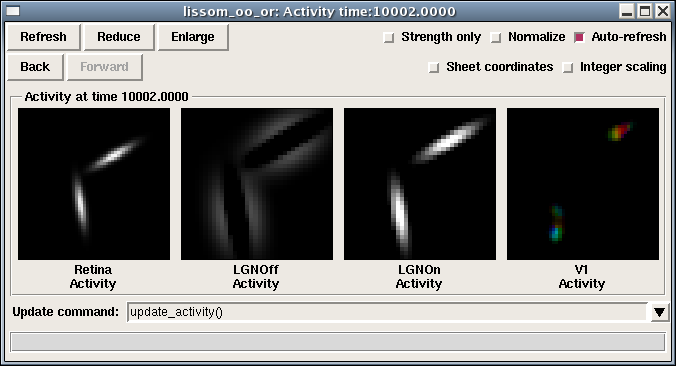
Here the color of each unit in V1 is determined by that unit’s orientation preference, so that one can see that different input orientations result in different types of neurons activated. measure_or_pref() changes the activity plot so that it is actually specified as a combination of three SheetViews on different channels:
- Strength: Activity
- Hue: OrientationPreference
- Confidence: OrientationSelectivity
That is, the primary plot (the Strength channel) is Activity, but it is colorized with the OrientationPreference (the Hue channel). The amount of colorization depends on the OrientationSelectivity (the Confidence channel), which is appropriate because unselective neurons then show up white. The monochrome plot shown first above was obtained by toggling the “Strength only” button, which disables Hue and Confidence so that the result is as it was before running measure_or_pref().
For a plot with multiple channels, moving the mouse over the bitmap will show the values in all of the available channels, and the right-click menu will allow you to see what channels are available, and to plot or analyze any of the channels independently.
The color coding can be changed to some other plot using the convenience function Subplotting.set_subplots:
from topo.command.analysis import Subplotting
Subplotting.set_subplots("Direction")
or disabled entirely:
from topo.command.analysis import Subplotting
Subplotting.set_subplots()
Preference map plots
The basic plots display data that is already available within Topographica, to visualize the structure or behavior of the model directly. Another important type of visualization is preference map plots, which measure and show the input patterns to which a neural unit responds most strongly. That is, they are an indirect measurement based on actively providing a stimulus and measuring the response. These maps are calculated using a general-purpose preference map analysis package, described below, and are primarily specified in topo/command/analysis.py. The available plots include:
- Position Preference
- Measure preference for the X and Y position of a Gaussian.
- Center of Gravity
- Measure the center of gravity of each ConnectionField in a Projection to one Sheet.
- Orientation Preference
- Measure preference for sine grating orientation.
- Ocular Preference
- Measure preference for sine gratings between two eyes.
- Spatial Frequency Preference
- Measure preference for sine grating frequency.
- Direction Preference, Speed Preference
- Measure motion direction and speed for drifting sine gratings.
- PhaseDisparity Preference
- Measure preference for sine gratings differing in phase between two sheets.
- Hue Preference
- Measure preference for color.
Receptive fields plots
Often, rather than a Connection Field (a set of weights from one Projection between two Sheets), you will want to know the Receptive Field (RF) of a unit – the locations to which it responds on an input sheet, even across multiple projections (i.e., multiple synapses).
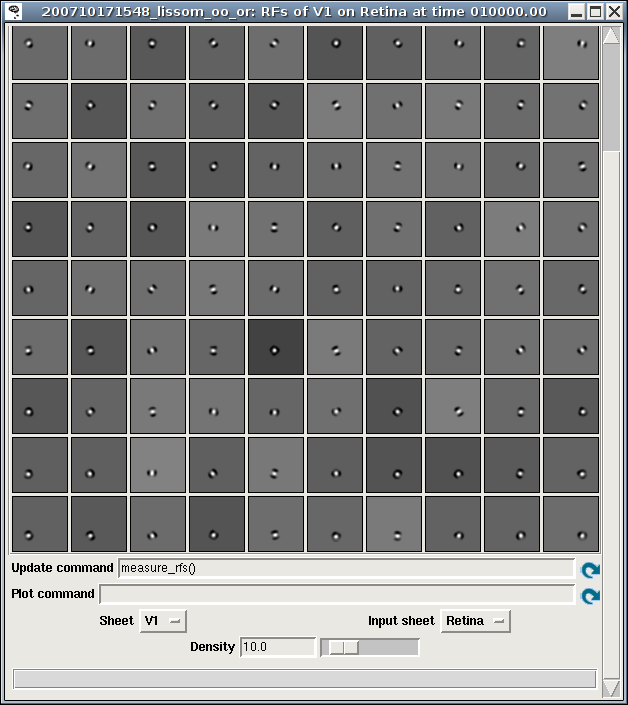
Such plots can be measured using the RF Projection plot, which uses reverse correlation to estimate which units on an input sheet cause the strongest response of a unit in a later sheet. It works just like a Projection plot, except that it takes much, much longer to measure (as it requires presenting a large number of test patterns), is not specific to any particular Projection, and is an estimate rather than a visualization of a set of weights. Example result for an ON/OFF LISSOM network trained on oriented Gaussians:
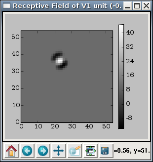
Once the RFs have been measured, the RF can be visualized for a particular unit by right clicking on that unit in any plot window, and selecting a Receptive Fields plot. Sample result:
Tuning curve plots
The above plots are all visualized as a two-dimensional array of values. Other common plots are visualized as a set of one-dimensional curves, including:
- Orientation Tuning Fullfield
- Plot orientation tuning curves for a specific unit, measured using full-field sine gratings. Although the data takes a long time to collect, once it is ready the plots are available immediately for any unit.
- Orientation Tuning
- Measure orientation tuning for a specific unit at different contrasts, using a pattern chosen to match the preferences of that unit.
- Size Tuning
- Measure the size preference for a specific unit.
- Contrast Response
- Measure the contrast response function for a specific unit.
Each of these plots shows the properties of one user-selectable unit. For instance, the Orientation Tuning Fullfield plot shows how the response of that unit varies with orientation and contrast:
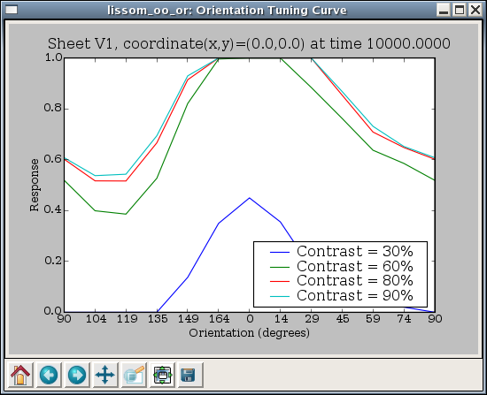
Here each curve represents one value of contrast tested, and each data point on the curve represents the response of this unit to an input of the specified contrast and orientation, as a maximum over all phases tested.
The tuning curve plots are measured just as the preference map plots are (and using the same code), but they are visualized in a different way.
Changing existing plots
The available plots are all specified in a general way that allows users to change the details of how the data is visualized. Each plot is part of a PlotGroup that specifies a list of commands (‘hooks’) to run to generate the data, and then how to visualize the results for all the Sheets in the simulation at once.
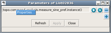
The list of hooks used is shown in the plot window as “Pre plot hooks”, where users can change the parameters of existing hooks, and add or remove hooks. For instance, if you want to reduce the number of sine grating phases used when measuring orientation maps, say, from 18 to 8, you can right click on the list of hooks, choose Properties, and then, in the new window displaying the list entries, right click on the measure_sine_pref.instance() entry:
This will give you a properties window for that item:
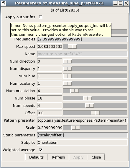
Here you can reduce the number of phases by dragging the appropriate slider. The next time the plot is refreshed, the new value will be used instead.
The properties window for a list entry shows what parameters are available; hovering the mouse over a parameter name gives a brief description. More detail about various commands is available in topo/command/analysis.py and topo/command/pylabplot.py.
Some plots also use “Plot hooks”, called after the “Pre plot hooks”, to actually visualize the results. For instance, some commands generate data for all units in a Sheet, but the PlotGroup displays results from only a single sheet; in this case the plot hooks (usually much quicker to run than the pre-plot hooks) are called whenever a new unit is selected.
If you often need to change the parameters for map or curve measurement, then you can do that easily without modifying your copy of Topographica by putting appropriate lines into the .ty script to which they apply. For instance, the default parameters used in most preference map measurement commands present each pattern for only a very short duration and turn off the response function, which works well with the example files because doing so results in a linear response (no threshold function and no lateral interactions) and thus makes the results independent of the input scale and offset. If this approach is not valid for your own model, then you can change the duration for which sine gratings are presented to 1.0, and turn on the response function by default:
from topo.analysis.featureresponses import MeasureResponseCommand
MeasureResponseCommand.duration=1.0
MeasureResponseCommand.apply_output_fns=True
These values are actually Topographica’s defaults, and thus omitting all code in your .ty file to do with MeasureResponseCommand would also have the same effect. In any case, the specific parameters here can be anything you want, and you can do it for any plot group.
Similarly, you can change the specific types of data used in each plot. For instance, you can remove the default OrientationPreference subplot from Activity plots using:
from topo.plotting.plotgroup import plotgroups
plotgroups["Activity"].plot_templates["Activity"]["Hue"]=None
plotgroups["Activity"].plot_templates["Activity"]["Confidence"]=None
(which is what Subplotting.set_subplots() does, for Activity and several other types of plots).
You can also put lines like these into your user configuration file, if you find that you always want different defaults than Topographica’s, for all scripts that you run.
Adding a new plot
The types of plots included with Topographica are only examples, and it is quite straightforward to add a new type of preference map plot. As a reference, here is an implementation of Orientation Preference plots:
1. pg= create_plotgroup(name='Orientation Preference',category="Preference Maps",
                        doc='Measure preference for sine grating orientation.',
2.                  command='measure_or_pref()')
3. pg.add_plot('Orientation Preference',[('Hue','OrientationPreference')])
4. pg.add_plot('Orientation Preference&Selectivity',[('Hue','OrientationPreference'),
                                                     ('Confidence','OrientationSelectivity')])
5. pg.add_plot('Orientation Selectivity',[('Strength','OrientationSelectivity')])
6. pg.add_static_image('Color Key','topo/command/or_key_white_vert_small.png')


7. def measure_or_pref(num_phase=18,num_orientation=4,frequencies=[2.4],
                       scale=0.3,offset=0.0,display=False,weighted_average=True,
8.                 pattern_presenter=PatternPresenter(pattern_generator=SineGrating(),
                           apply_output_fns=False,duration=0.175)):
       step_phase=2*pi/num_phase
       step_orientation=pi/num_orientation

9. feature_values = [Feature(name="frequency",values=frequencies),
                         Feature(name="orientation",range=(0.0,pi),step=step_orientation,cyclic=True),
                         Feature(name="phase",range=(0.0,2*pi),step=step_phase,cyclic=True)]

10.param_dict = {"scale":scale,"offset":offset}
11.x=FeatureMaps(feature_values)
       x.collect_feature_responses(pattern_presenter,param_dict,display,weighted_average)
What the first part of this code (the PlotGroup specification) does is:
- Declare that the Orientation Preference plot group should go on the Preference Maps menu, with the indicated help string
- Declare that before trying to plot this data, generate it by calling the command “measure_or_pref”, which is defined next.
- To this plot group, add up to one plot per Sheet named “Orientation Preference”, plotting any Image named OrientationPreference, using a color plot (as the Hue channel).
- Add up to one more plot per Sheet, this time plotting the Orientation in the Hue channel and the Orientation Selectivity in the Confidence channel (so that unselective neurons show up white).
- Add up to one more plot per Sheet, this time plotting the the Orientation Selectivity by itself in grayscale (as a Strength).
- Add a color key as a static image appended to every plot.
The rest of the code specifies the actual procedure for measuring the appropriate data:
- Declare the parameters accepted by measure_or_pref()
- Define the default object that will generate input patterns, in this case sine gratings (but any other PatternGenerator can also be used).
- Specify the ranges of parameter values to be tested – each of these defines one possible map (FrequencyPreference, OrientationPreference, and PhasePreference, in this case). The contents of each map will be an estimate of the value of this parameter that will most strongly activate the corresponding unit.
- Add a few more parameter values that will not be varied (and thus will not generate preference maps).
- Present all combinations of feature values and collate the responses.
The preference for any input pattern can be measured using nearly identical code, just selecting a different PatternGenerator and specifying a different list of features to vary. For each feature, you will need to know the range and number of steps you want to test, plus whether it is cyclic (i.e. wraps back around to zero eventually, and is thus best visualized as a Hue).
Note that the selectivity is by default boosted significantly so that combined plots will be visible, because the selectivity scales are essentially arbitrary. To change the scaling in specific cases, you can adjust the FeatureMaps.selectivity_multiplier parameter:
from topo.analysis.featureresponses import FeatureMaps
FeatureMaps.selectivity_multiplier=1.0
Also note that the Orientation Preference plot code above shows just one possible way of implementing such a plot; in Topographica itself, a hierarchy of classes is used to simplify the definition of multiple types of plots.
Additionally, the data for plotting can also be calculated in any other way (ignoring FeatureMaps and PatternPresenter altogether), as long as it results in a Image added to the appropriate sheet_views dictionary and specified in the template. For instance, the measure_cog command used in Center of Gravity plots simply looks at each ConnectionField individually, computes its center of gravity, and builds a Image out of that (rather than presenting any input patterns).